Following on from part one, we’re going to look at some of the things you can do to make your website more accessible for older people and people with disabilities.
The great thing about the Web Content Accessibility (WCAG) 2.0, is that there is a wealth of advice and success criteria that can help you find conversion rate optimisation (CRO) ideas.
As I have found implementing changes on my own clients’ websites, small changes can make a big difference in conversions. So here are a few suggestions about what you can do to improve conversions on your website but also, make it easier for visitors.
Visual changes
As I mentioned in part one, our eyes will change as we get older so it is harder to focus on a computer screen or mobile device.
- We will need more light to see
- We will find small text and detailed images harder to see
- We will perceive colours differently
One of the easiest things we can do to help people with visual problems is to increase the contrast of colours on a website. This includes text against the background colour, images, and logo etc. Black text on a white background is, in theory the ideal, but it doesn’t always look very nice. We might think that a mid-grey text on a white background looks better, but it’s actually really hard to see if your eyesight isn’t 20/20. It also worth noting that people with dyslexia can be sensitive to the glare of a white background. If you’re building a website or looking for CRO changes, maybe opt for something less harsh than #ffffff for the background.
The same goes for text links within page copy. Much of the time, a website user may not even recognise the anchor text as a link because the colour and style is barely any different from the standard text style. Hyperlinks may look ugly, but if you would like users to immediately identify an unvisited link, you should set the style to be underlined and in #0000ee (RGB 0, 0, 238).
Whilst we’re on the subject of the appearance of text, capital letters are a pet hate of mine because each letter ‘jolts’ and you never pick up your flow to read. Also, online it is seen as shouting so here is my personal and official call to the whole web design community: Please, let’s ditch the caps!
Reducing cognitive noise
This one is a little harder to understand if you don’t recall the omnishambles that was a teenager’s MySpace page or, a web page from the 1990s with yellow smiley faces rolling all over the place!
Those days may be long behind us but every day, I still see websites that confuse me and I wonder how on earth they convert visitors.
Personally, I have been referring to visually overwhelming websites as ‘cognitively noisy’, particularly when I land on a website and think “Where on earth do I look first?” and, “I can’t see what I want!”.
We all think that we love simplicity and that, as a result, we’re incapable of creating a website that is confusing but, working with a client who has several stakeholders, each with their own agenda fighting for prime real estate on your website, you very quickly end up down the rabbit hole and looking at a website that you barely even recognise.
By referencing any of the four principles or 12 guidelines of WCAG 2.0, you are offering the strongest reasoning for your CRO decisions, rather than relying on it looking good.
Assistive technology
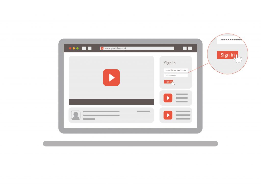
Assistive technology has been around for a long time but most able-bodied users simply aren’t aware of it.
Here are some examples of existing assistive technologies:
| Input | Output |
| Voice recognition software | Screen readers |
| Braille keyboard | Text readers |
| Eye tracking | Refreshable braille display |
Voice recognition software and home assistants, such as Alexa, are exploding in popularity, but the technology itself isn’t new. Marketers can’t identify in Google Analytics what technologies are being used, most likely to protect users from discrimination.
Screen readers and text readers are different beasts, but screen readers in particular rely heavily on properly optimised websites and text. They will read out meta titles and headings etc, so your meta title needs to make sense to a person rather than just a search engine. Your headings should follow a logical format that properly explains the content on the page.
As internet marketers, we can sometimes be guilty of just adding keywords to image alt text, but a description of what is in the image is far more useful to visitors who are blind and partially-sighted using a screen reader. Bearing this in mind, it can be tricky to make an infographic accessible to visitors.
Even sighted users are put off by big walls of text on a page and breaking it up with header tags and bullet points are really helpful for all users.
Can I click on it?
When building or optimising your website, do you ever think about people who have motor problems? Clicking on a tiny circle to select an option in a list, or a tiny arrow to click through to a blog post, is fairly easy for more able users, but for users with motor problems it is really difficult. Even a drop down menu where options disappear can leave less able users infuriated.
There are many reasons why someone may have trouble with dexterity and hand eye coordination, for example a stroke or Parkinson’s disease. There are also an estimated 10 million people in the UK suffering from arthritis and, whilst they won’t all struggle with using their hands, it’s a significant proportion of the population and a large number will be older people.
If you must use drop down menus, try extending the time that they hang down for and definitely test that they can be accessed with a keyboard.
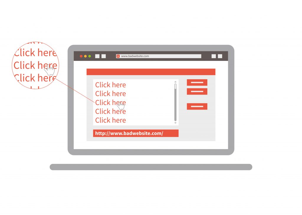
How about your text links and anchor text?
Screen readers offer a feature called a links list, where users can have a list of all links on a page read to them. This uses a link’s anchor text and if the anchor text is just “click here” or something completely indistinguishable from what the user will expect to see, then it makes the website very hard to navigate on a screen reader.
What about video?
Videos are growing in popularity, but users who are deaf or hard of hearing can really struggle accessing this type of content.
I previously mentioned success criteria and levels of conformance. The most illustrative example is making video content more accessible. Video content is growing in popularity and even Facebook is more likely to show a video posted on a business page to fans rather than a post.
As you can see below, it’s very difficult to meet AAA standard so I would recommend offering captions and a transcript as a minimum requirement for any videos you produce.
Example of WCAG 2.0 conformance – video
Level A – captions
Level AA – audio descriptions
Level AAA – sign language
Audio descriptions and sign language are a huge ask and not strictly necessary when there are plenty of text options available to users.
This blog only just scratches the surface of using WCAG 2.0 for conversion rate optimisation. If you want to know more or want to discuss the subject, let’s continue the conversation on Twitter/Facebook/LinkedIn.