This month Adtrak is turning 20! In the run up to the Adtrak 20 celebrations, we thought we’d take a look back on the evolution of the Adtrak brand. Al Davies, one of our incredibly talented Senior Graphic Designers and the man largely responsible for the development of the Adtrak brand, gives us a rundown of how it’s changed over time and, most importantly, why…
So there I am: a fresh-faced designer, 28 years young, in the early stages of male pattern baldness, first day on the job. I’m wanting to make a big impression, but not wanting to rock the boat at the same time.
“We’re not changing the logo, Al.”
“Are you sure? I mean it’s a little dated, I had this idea where we…”
“We’re not changing the logo, Al.”
“But…”
“We’ve had it over 10 years, it’s part of who we are. We’re never changing the logo.”
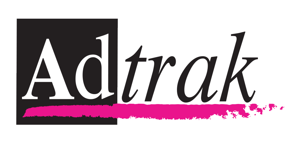
The original Adtrak logo.
What did Adtrak’s logo look like in the halcyon days of 2008? Pretty much exactly how it looked when the company was founded in 1997, now you mention it.
It… hadn’t aged well.
To be fair, it’s all too easy to mock an old logo. As a designer, you always aim to create something timeless and classic, but very rarely does any of your work truly stand the test of time.
When you look at the late-90s world, however, the original Adtrak brand wasn’t far from what was gaining traction in our original marketplace. It emphasised what we were about and used a high-contrast, limited colour palette with Garamond – a classic, condensed serif typeface (I remind you even Apple were still using this typeface for their brand until 2002). Sure, we can look at it now and pick holes in it, but 20 years ago it was fine. Just.
Ch-Ch-Chaaaaanges
11 years from conception, the original logo hadn’t changed. However, as a company, change had been fast. We were offering web design and SEO, in addition to our initial advert and call tracking services, we had grown drastically in numbers and, although our demographics were the same, their tastes had evolved significantly. It was time for a change.
In many ways the ‘bullseye’ logo, which was created in 2008, dated just as much as the original logo (if not worse, frankly), but the changes we started to make with it were important. We knew that if we were to ever change the Adtrak logo, it needed to have strong connections with where it came from, both because of internal feelings as well as our client base’s familiarity with it. But we knew that change was needed.
We went with a bespoke variant of a different classic typeface (Avant-Garde) and paired it with a hot pink bullseye in the bowl of the lowercase ‘d’. This came about because we’d started to maintain a corporate line about how targeted our approach was, and this was the clearest way of visually representing that (maybe a little ‘on the nose’, but still).
![]()
From there, we even introduced our first icon, a paint-splattered bullseye in an attempt to combine our targeted approach with a creative / plucky-outsider flair. However, the bullseye icon was used… intermittently at best.
The wordmark, on the other hand, stuck around. With the black now softened to a charcoal to lessen how ‘stark’ it felt, it lasted a good 5 years (on average a logo lasts around 3 years before it gets ‘refreshed’ to a certain degree).
2008 was also when we first started tentatively treating Adtrak as more of a brand. We didn’t just slap the logo on something and call it ‘branded material’, we had defined typefaces. We even used the same typefaces on our website that we used in print! We had agreed usage for colours and paid attention to the written message as well! We were through the looking glass here, people…
2013
2013 was a massive year for Adtrak as we began preparations to move office. As a result, we were told to start preparing to work up some artwork for the walls of the new office and some new promotional material to publicise it.
“This is a great opportunity to modernise our look, we could…”
“We’re not changing the logo, Al. We already changed it once 5 years ago.”
“But…”
“Not. Changing. Al.”
What followed was the biggest change that the Adtrak brand has seen to date. Where 2008 was a revision keeping its links to its conception, this was a clean break to position the brand’s voice for what we had become and where we were going.
Again, the business had changed dramatically since the previous logo was created. Local directory advertising was something we just didn’t do anymore, and that SEO thing we’d just started to dabble with in ‘08 was now – with it’s sister department Pay Per Click – the main revenue stream for the entire company. It was what we were known for, even getting the attention of the almighty Google. Throw in the fact that we now did Photography and it was clear that we were a very different company. A very modern company.
This prompted a big change: from pink to orange. It didn’t happen because orange is a more positive colour, nor that we wanted to make a drastic change in that department. It was made because it would look better on the walls!
With moving to much bigger, fancier offices, we wanted to make our working environment not just suitable for staff to operate in, but also a real feature for clients to visit. The hot pink just wasn’t really working, so our MD made the call to change the primary brand colour.
For us as designers, this opened up a whole world of options. We were able to add complementary tones, such as a plum purple and a dark red, as well as pairing with a contrasting teal, which eventually got accepted as the brand’s secondary colour. It meant we can adapt our marketing to our needs, going for contrast when impact was needed, and complementary when subtlety was required. All the while staying ‘on brand’ and not looking like two separate companies with two different things to say.
This was great for us. This colour palette allowed us to embrace interaction, openness and warmth, and it ended up looking pretty good around the office, too!
Finally, the big one. The logo itself was going to change. The bullseye had long gone, but now we needed to find a new wordmark that would hopefully last even longer.
One of the mistakes we’d made with both of the preceding logos is a common one – put all of the brand’s character into the logo and worry about the framework it sits in later. That often means that you get left with a logo that looks great in isolation but, when you put it in the context of an advert or a brochure, it either stands out like a sore thumb or just ends up a visual mess.
![]()
The brand new Adtrak logo.
Sometimes it’s best to keep the logo really simple and then add additional patterns and graphical elements as necessary.
That’s the approach we went with. We chose Kaleko from TalbotType, a modern humanist sans serif that uses ‘proper’ lowercase a’s (with the arm hanging over the top of the bowl) as that’s the most legible form of that letter. This means we can use the logo in a small size and it’s still legible.

For really small-scale usage, we developed the bracket icon – a nod to the fact that our business is predominantly online these days.
Backing all of this up, we went with a ‘big header’ approach to layout. Strong, simple messages set on uncluttered flat backgrounds, with little line dividers here and there. It meant that we could get over simple messages in a simple way.
This version of the brand was the first that we really managed to developed properly. We were able to establish a consistent look for everything from internal presentations, to exhibition stands and marketing material (both online and offline). And, thanks to the work of our Communications Coordinator and team of copywriters, we developed a true tone-of-voice.
It also meant that we had flexibility with our visual brand going forward. If things start to look a bit stale, we don’t have to change the logo, we can just do a milder refresh of everything around it. If you put all of your brand’s unique character into just the logo, it means any future brand refresh HAS to change the logo, and sometimes you lose the consistency and brand recognition that you had built up.
Don’t Look Back In Anger
You may think that I’m poking fun at our big boss man who was always insistent that the brand didn’t need to change, but actually it’s about something else. In this day and age of business, a sign of strong leadership is understanding that a brand often needs to change and adapt to both how a company grows and how the marketplace develops.
There are many companies whose management have grown attached to their logo and resist change. It’s very common and that’s totally understandable! They have that emotional connection to it that ultimately designers strive to build up with a client’s audience. But sometimes their audience doesn’t have that same connection, and designers are always appreciative when someone says “I personally still like it, but I understand it needs to change, and I trust you to make the right call on this.”
The Adtrak brand has changed because we’ve changed as a company and so has the nature of our marketplace. Sometimes change is highly desired, sometimes it has to be really questioned, but it always has to be considered. Even if you decide to stick rather than twist.
We’ve got a look now that’s definitely more reflective of who we are as a company, and who we are as a little community of designers, marketers, photographers, and copywriters. The visuals match the message now, and that’s the most important thing to try and achieve.
And of course the logo I did is really great now, so we’ll never need to change it…