The branding created for each Olympic Games is considered the most complex visual identity in the world because it is supposed to signify not only the games, but also the host city. It then has to be applied to anything from small objects like pens to large billboards whilst representing the city as a whole.
We have selected our favourite top 3 Olympic logos of all time and Mexico takes the gold!
1. GOLD - Mexico Summer 1968
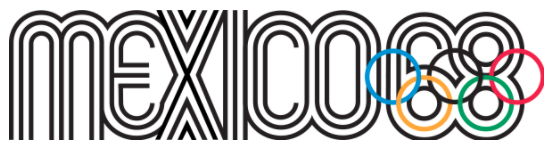
Mexico's Olympic logo takes 1st place for its clever geometrical form, specifically constructed to represent a running track. The five rings are central to the design - they’re perfectly integrated rather than being an additional element as seen on many of the other Olympic logos.
It was created by a New York designer called Lance Wyman who was tasked with envisioning what would represent Mexico City. They had two weeks to come up with the concept and created the chosen logo in two days. Wyman said. “The solution is an obvious combination: we had the place, the year, and the Olympic rings. Because the geometry worked so well, we were able to do it and create an image that was memorable.”
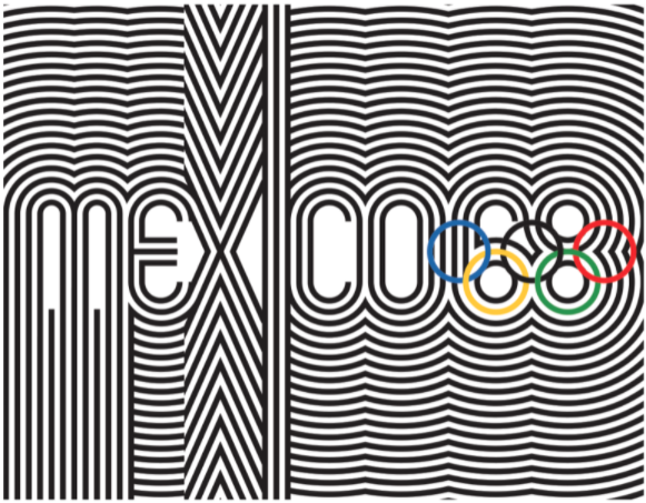
Wyman was also influenced by Mexican artwork and geometric structure, mixing it with an optical art style. “The idea of the optical art: sports are speed, strength, balance. All of those things that are animated by sports themselves, I thought we could do that with the graphics.” Wyman said. “It was making it expressive, making it beautiful, making it strong. It had a cultural characteristic when we put it all together.”
Although not that legible, this kind of type treatment was groundbreaking at the time. A modern, lower-case, repeated linear font merges the individual letters to produce a unique look. The need to incorporate the Olympic rings into the logo sacrifices legibility further, using the lower half of ’68’ as the bottom rings. Although the logo isn’t perfect, it's a representation of pushing the boundaries of design in that era, encouraging people to experiment with typography and layout which is why we have chosen Mexico 1968 as the best Olympic logo.
2. Silver - Rio 2016
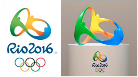
Rio 2016 wins silver for its vibrant colour palette and strong links to local culture. Whilst mainly printed in 2D it is also the first Olympic logo to be created in 3D. The bespoke brush script typeface is perfectly paired with the logomark and they compliment each other by being equally expressive. The overall feel is full of character and movement, reflecting the vibrant colours of the city.

The logo was created by Rio-based agency Tatil who came up with 50 logos before deciding upon the final design. Tatil wanted the logo to truly reflect the essence of Rio’s citizens. In an online case study they said “We were born from a mixture of ethnicities. We warmly embrace all ethnicities, faiths and generations. We share our sky, our ocean and our happiness with the world. This human warmth, which is part of the Carioca nature and the Olympic spirit, is shaped by the exuberant nature of a city that inspires us to live passionately and carefree, and loves to share and engage with others.”
This led Tatil to the chosen logomark of people holding hands, connecting in an excited and animated way. However, the logomark was so much more than people holding hands - within the three figures you can also make out the abstract letter forms to read the word ‘RIO’. The curves in the emblem are also shaped to represent one of the most famous landmarks in Rio called Sugarloaf mountain. All of the curves and spaces represent local landmarks, from the surrounding mountains to the islands allowing the logo to truly reflect the local landmarks and culture of the host city.
3. Bronze - Montreal 1976
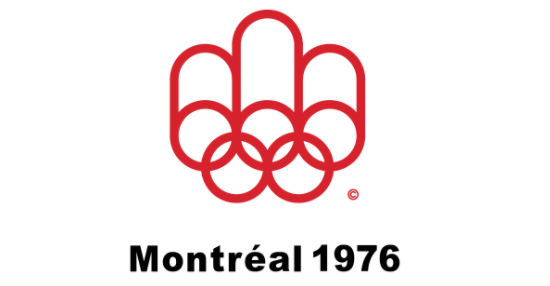
Montreal wins bronze by delivering a maximum effect logo mark through symmetry and simplicity.
The 1976 Olympic logo was designed by Canadian designer Georges Huel. Huel created a logo that was so simple yet clever by simply extending the curves of the Olympics rings to create an ‘M’ for Montreal. Huel said ‘I wanted to work with one symbol… clean and neat.’
The M also represents the podium that the winners stand on and the stadium track is in the centre of the logo, linking the middle curve of the ‘M’ with an Olympic ring.
The 1976 logo is both minimalist and modern in style, ensuring a timeless appeal that is still striking today. The typography is basic and unassuming, probably to put more emphasis and focus on the logo mark itself.
Reference links:
Rio logo
https://www.creativebloq.com/logo-design/4-things-you-didnt-know-rio-2016-olympics-logo-21619348
https://www.dezeen.com/2016/08/11/rio-2016-motif-first-3d-logo-history-olympics-fred-gelli-designer/
Montreal logo
https://canadamodern.org/georges-huel-montreal-olympics-art1/
https://wemadethis.typepad.com/we_made_this/montreal-olympics-1976.html
Mexico Logo
https://globalsportmatters.com/1968-mexico-city-olympics/2018/10/04/memorable-1968-olympic-logo-used-lines-as-power/