2021 has seen some huge company rebrands. With a changing market and way of life, it’s important for brands to stay fresh and innovative to keep up with their competitors.
Let’s take a dive into some of our favourites...
KIA
Starting off with KIA, the car brand that used to be known for cheap, low-quality cars. In 2021, they became a serious competitor in the family car market with their promise of offering new products and services. This new spot in the market has been pushed by their bold rebrand, which has seen a transformation of not only their logo, but their entire identity, creating a far more modern and clean look.
Their previous and most familiar logo (below), which was introduced in 1994 and updated in 2004, was starting to fall behind the new models and no longer fit in with the brand’s new target styling. The updated handwritten signature style logo represents their commitment to bringing moments of inspiration, while its sleek symmetry shows confidence. Though there has been some confusion on the lettering of the logo, with some viewers seeing it as “KM”, we feel the duplicate use of the triangular angle is genius.

Burger King
Going back to basics… but we love it.
The fast food company made the decision to rebrand in order to enforce their new mission of changing customers’ perception of their food - with the removal of artificial ingredients. Originally, the company wanted only a campaign to support these claims, but the creative brand agency, Jones Knowles Ritchie, believed this wouldn’t be enough to enforce these claims. Instead of a campaign, the agency decided it was time for a complete rebrand of the company, to change customers’ attitudes towards the brand itself.
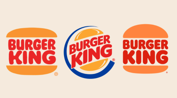
The owner of Burger King, Fernando Machado, said: “Updating our visual identity would help signal to our consumers that this is a brand that is evolving.”
The new logo imitates the 1969 and 1994 logos which show the brand name wedged between two buns. Lisa Smith, Executive Creative Director at JKR, said that “it was never deliberately intended to be a homage to the past. It was meant to take the best things that felt like Burger King”. Ellie Doty, Chief Marketing Officer of Burger King, says that the new design “seamlessly pays homage to the brand’s heritage while reflecting the changes in our world and our brand with a refined design that’s confident, simple, and fun.”
Renault
Another car brand that updated their look in 2021 was Renault, the French multinational automobile manufacturer established in 1899. While they haven’t completely changed their overall brand identity, they did update their iconic diamond shaped logo.
Similarly to other companies, Renault wanted their new logo to propel their brand into a new era. The simple and standalone logo has been designed to live in movement. The decision to create an interlocking, flat design would translate well online and for animation, and we’re liking what we see!
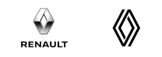
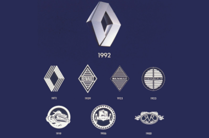
When looking at their logo evolution over time, it’s clear to say they took some inspiration from the 1972 logo, which makes use of interlinked stripes.
Gilles Vidal, Renault’s Design Director, said: “The diamond is one of the most recognised shapes in the world and in the world of the automobile. It is a simple geometric shape, with a strong, powerful identity; the challenge was to renew this shape by giving it meaning, new, contemporary values to project the brand into the future.”
Pringles
For the first time in twenty years, the snack brand Pringles has rebranded its logo and packaging. Like all previous logos discussed, they have adopted a flat style, making it easier for use in digital.
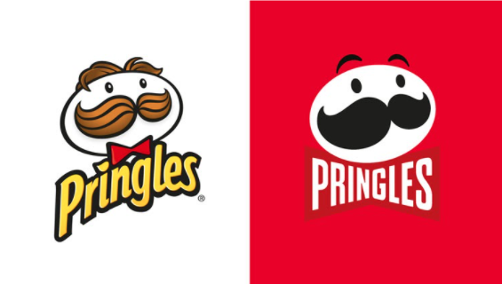
The public’s perception of this rebrand is that many think it has gone “too far”, and that it’s just not the same with Mr. P’s noticeable hair loss. Despite this, Mr. P has gained some expressive eyebrows, which we feel helps bring him to life.
“Pringles has always had such an iconic look and feel, we wanted to refresh the design and Mr. P without losing our strong visual identity. The intention with the new look is to simplify and modernise the design, giving the brand’s mascot a bold makeover and highlighting the stack-ability of the crisps across the range”, says Pete Matthews, Brand Design Director from Pringles.
Sources:
- https://www.fastcompany.com/90665634/burger-king-rebrand-innovation-by-design-2021
- https://thinkmarketingmagazine.com/burger-king-goes-through-rebranding-after-20-years/#:~:text=Another%20brand%20is%20getting%20a%20makeover%20in%202021.&text=It%20was%20announced%20earlier%20this,and%20even%20its%20employees'%20uniformhttps://www.renaultgroup.com/en/news-on-air/top-stories-2/a-renaulution-for-the-diamond/
- https://www.creativereview.co.uk/renault-new-logo/
- https://www.creativereview.co.uk/pringles-rebrand-design/
- https://www.transformmagazine.net/articles/2021/pringles-mascot-unveils-first-makeover-in-over-20-years/
- https://www.itsnicethat.com/news/kia-logo-rebrand-graphic-design-060121
