
In November 2018, Google rather quietly rolled out a major update to its PageSpeed Insights tool, in which they basically scrapped the previous scoring mechanism, opting to instead produce the analysis via their more powerful Lighthouse auditing tool.

As you would expect with such a radical change, the update had a significant effect on our PSI scores, but somewhat curiously so. Our desktop scores rocketed across the board with many sites now scoring the maximum 100 (or very close to), but mobile scores seemed to fall in general – drastically so in some cases. But why?
In this article, I’ll be looking at:
- What’s changed
- Why mobile scores are so different to desktop now
- What we can implement to tackle these changes
- Additional page speed tips
- Some PageSpeed Insights testing tips and things to be aware of
- Ultimately, how to get a great PageSpeed Insights score
It’s a bit of a beast, so get comfortable and maybe grab yourself a coffee – you’ll need the caffeine to stay awa–I mean it’s absolutely great and exciting and you’re going to love it and it’s definitely not boring at all!
What's Changed to PageSpeed Insights?
A lot, basically. The previous iteration of PSI was pretty primitive to say the least; it provided hard and fast rules without a lot of context, which – if followed – would boost your score, but wouldn’t necessarily boost your site’s actual load times. It made it easy to lose sight of the ultimate end goal (to make your site faster) and instead focus on increasing that PSI score, with the two not always correlating.
For example, if you minified your JavaScript and ensured it wasn’t render-blocking, you’d get a big ol’ pat on the back from PSI, even if that JS was bloody massive and prevented the user from being able to actually interact with the page for a considerable amount of time.
And that’s where the new Lighthouse powered system has really stepped things up.
The previous PSI put a big emphasis on the First Meaningful Paint metric (rendering the “above-the-fold” portion of your page as quickly as possible), whereas the new, Lighthouse powered PSI has shifted its focus to take greater consideration of the whole page load experience.
For the mobile report, PSI now provides lab data via Lighthouse by simulating the page load on a Moto G4 (which they describe as a mid-tier mobile device) and on an emulated mobile network, which is the equivalent of a fast 3G connection or a slow 4G connection.
Included in this lab data are new metrics such as First CPU Idle (the point at which your page first becomes able to handle user interaction) and Time to Interactive (the point at which the whole of your page is fully able to handle user interaction).
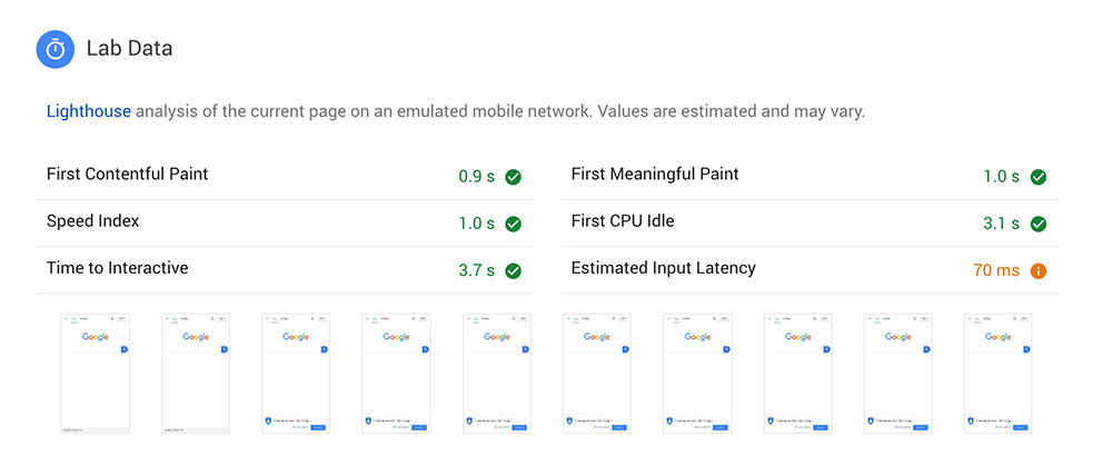
As I alluded to previously, these new metrics look at the whole page load process rather than just focusing on First Meaningful Paint, so if you have lots of JavaScript or third party elements on your page (such as Google Maps or video iframe embeds), then you will be punished accordingly, as those kind of things will increase the time it takes for your page to be fully interactive.
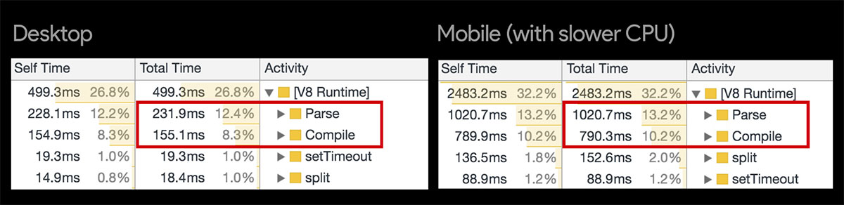
But why, I hear you scream, do these factors only seem to impact the mobile score and not the desktop score? Why am I scoring 100 on desktop but only 50 on mobile? Well, this is where the disparity between the actual devices and their respective specs comes into play. As well as a slower network, the mobile tests are run using a Moto G4 device, whose CPU cannot parse and compile scripts anywhere near as quickly as a desktop machine, often resulting in much larger Time-To-Interactive numbers – and thus much lower mobile scores. We’ll go into how to address this shortly.
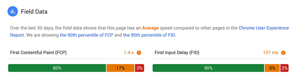
An additional newcomer to the PSI report is the Field Data section, in which you are given real world data about your page speed from the Chrome User Experience Report (CrUX)! This shows how your page has loaded for real life Chrome users over the last 30 days – you’ll soon find it’s often not available for every site, but it’s a banging bit of data when it is.
So What Can We Do?
I’m going to run you through a few of the techniques that have delivered the best results on our sites since the latest PageSpeed Insights release. The recommendations we’ll be getting our teeth into are:
- Streamline your critical path
- Optimise your images and serve next-gen formats
- Lazy load all the things
- Review your web font loading strategy
- Deliver less JavaScript (consider code splitting)
Again, this list is far from exhaustive; it’s a select few optimisations that have delivered the most gains for us during our recent testing. So let’s get started…
Streamline your critical path
Firstly, the Time to First Meaningful Paint is still extremely important, so we still need to prioritise that top portion of the page and remove render-blocking resources from the critical path.
Here’s a quick summary of what you can do on this front:
- Identify your critical CSS and inline it into the
<head>of your page- Remember that the size limit for your initial HTML document (gzipped) is around 14kb, and this includes your critical CSS, so keep it lean
- Ensure you are only including CSS that is required for rendering the critical portion of your page (not things like mobile menu styling and modals, as these components are usually hidden to start with anyway)
- Ensure any other stylesheets are minified and being loaded asynchronously – Filament Group’s loadCSS() function is a great way to do this
- Ensure your scripts are minified, are included in the footer and have the
deferattribute
That’s the kind of stuff the previous incarnation of PSI pushed us to do, so this should be a relatively well-trodden path if you’re a seasoned PSI user.
Optimise your images and serve next-gen formats
Again, PSI has always kicked up a fuss about unnecessarily large images (and rightly so) – whether that be in terms of file size or actual physical dimensions – and fortunately it’s a pretty effortless task to shed those surplus bytes (without sacrificing image quality) using an image compression tool such as TinyPNG – one of many available to choose from.
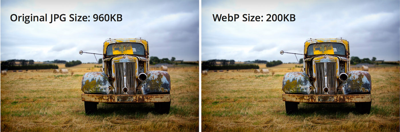
With the latest update, PSI is taking image optimisation further still.
It’s 2019 now and Google wants you to get with the times already by serving your images in “next-gen” formats for browsers that support them. These newer formats – WebP, JPEG 2000 and JPEG XR – offer much better levels of compression than the standard JPEG and PNG formats we’ve relied on for all these years, meaning they’ll load quicker and use less data!
The browser support situation here is a little fragmented, but between the three of them they cover pretty much all bases:
- WebP – Edge 18+, Firefox 65+, Chrome 23+, Opera 12.1+, Android Browser
- JPEG 2000 – Safari 5+, iOS Safari 5+
- JPEG XR – IE9+, Edge 12+
Evidently, WebP comfortably wins the battle for most browser support, but with a not-insignificant hole in iOS Safari. This hole can be filled by JPEG 2000 whilst the JPEG XR format can handle the increasingly insignificant Internet Explorer.
Personally, I’d just go with WebP (with a standard JPEG or PNG fallback), unless of course your usage stats show a large chunk of your users are on iOS Safari or IE, in which case you might want to provide the other formats too.
And here’s how you can serve these next-gen image formats – with fallbacks – using the <picture> element (which itself now has excellent browser support, IE aside):
<picture>
    <source type="image/webp" srcset="path-to-your-image/image.webp">
    <source type="image/jp2" srcset="path-to-your-image/image.jp2">
    <source type="image/jxr" srcset="path-to-your-image/image.jxr">
    <source type="image/jpeg" srcset="path-to-your-image/image.jpg">
    <img src="path-to-your-image/image.jpg" alt="image alt text">
</picture>
If IE support is crucial, you can use the Picturefill polyfill to add support for <picture>.
If you’re on WordPress, the WebP Express plugin is an excellent way to avoid the manual toil of altering the markup for all of your images, as it can automatically convert your JPEGs and PNGs to WebP in supported browsers, with practically no setup! The only caveat is that it can’t handle transparent PNGs, so you’ll have to resort to the <picture> method demonstrated above for those instances.
Lazy load all the things!
Another technique that has reaped big rewards whilst optimising our sites since the update is lazy loading various elements of the page, and it’s easy to see why when you think about what lazy loading actually does.
When you lazy load something on your page, this element – along with any additional resources it relies upon – is essentially completely removed from the initial page load experience, and not loaded in until it’s required by the user. There are various ways of implementing lazy loading, but most methods trigger the load when the element is almost in the viewport, or perhaps on a particular event, such as a click or tap.
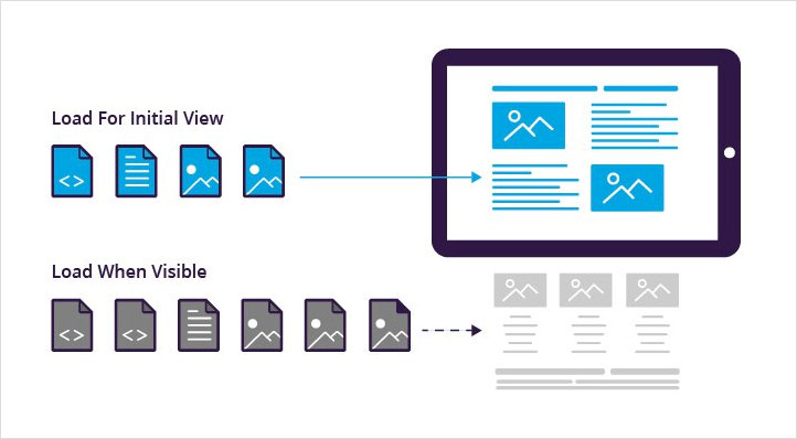
Subsequently, if you apply lazy loading to all of your images, video embeds, map embeds, and any other iframes you may have on your page, you can see how that could have a monumentally positive impact on the initial page load experience (especially the Time To Interactive), and thus, your PSI score.
As previously mentioned, there are many ways of implementing lazy loading on your site, but the best I have come across is via the lazysizes script – it really couldn’t be much more straightforward, as outlined below…
How to implement lazy loading on your site
Firstly, download the lazysizes script and include it in your site’s footer like so:
<script src="path-to-js/lazysizes.min.js" async=""></script>Then, on all of the images and iframes you want to lazy load, change the src attribute to data-src, and add a class of ”lazyload”. For example:
<img class="lazyload" data-src="path-to-img.jpg" alt="Img alt text">
<iframe class="lazyload" data-src="https://www.google.com/maps/embed......"></iframe>
Now, when the element is close to being in the viewport, the lazysizes script will grab the data-src value and insert it into an src attribute, which will subsequently allow the element to load.
Finally, add the following CSS to your site to prevent the broken images from being visible until they’ve been loaded in.
.lazyload,
.lazyloading {
    opacity: 0;
    transition: .2s;
}

.lazyloaded {
    opacity: 1;
}
And that’s literally all there is to it! There’s no additional setup required – it’s as simple as that. An outrageously quick win, with potentially really big gains.
Review your web font loading strategy
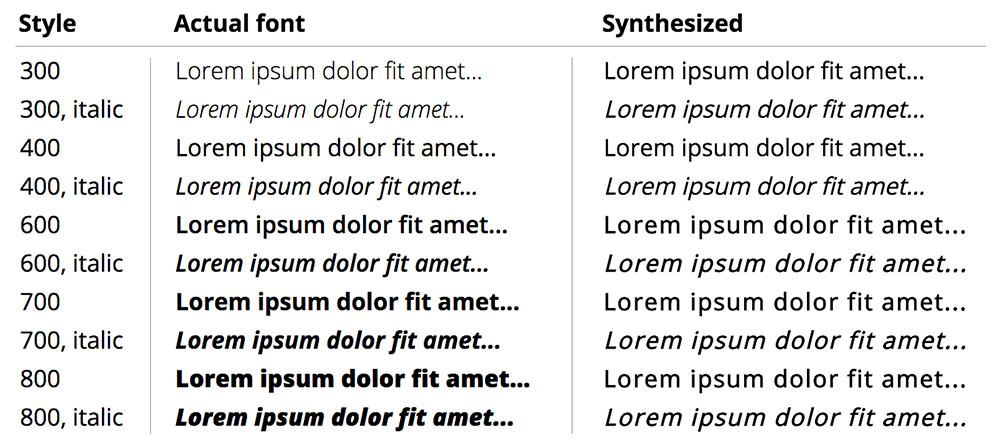
Web fonts are often one of the biggest contributors to a poor page load experience, with their usage ever on the increase. Remember that if you’re loading a single font with five different weights, you are loading five different web fonts, not one!
You should really try to minimise this number as much as possible, without compromising the design or usability of the page beyond reason. Consider if you can remove any weights that are used very little or even not at all (it happens!). Removing any italic web fonts is also an option – If you do, the browser will “fake” the italic behaviour for you through something called font-synthesis, which may be an acceptable trade-off for certain typefaces.
You could be forgiven for thinking there can’t be that much we can do when it comes to loading our web fonts. But oh boy would you be wrong. Just ask Zach Leatherman of Filament Group, who has written around 50 (that’s fifty) articles on the subject, each one containing extremely valuable and practical content on web fonts and optimising the loading process.
I implore you to read as much of his stuff as you can, as there is so much information and context that would be impossible to cover here, but I’m going to describe the relatively simplified process I have decided to implement as a result of reading and watching Zach’s material.
Eliminating the FOIT
First of all, let’s address PSI’s new web font warning: Ensure text remains visible during web font load.
This is in reference to the Flash Of Invisible Text (FOIT) that occurs whilst your web font is loading – which effectively makes your web font a render-blocking resource I might add. But it is very easily preventable (in theory)!

We can utilise the new font-display CSS property and its swap value to render the text immediately in a fallback font, and then swap in the web font once it has loaded. This effectively transforms your FOIT experience into a FOUT experience (Flash Of Unstyled Text), which is certainly the lesser of two evils, but must be used with care as there could be jarring reflows on your page when the font swap actually occurs.
@font-face {
    font-family: 'Source Sans Pro';
    src: url('path-to-your-fonts/source-sans/sourcesanspro-regular-web font.woff2') format('woff2'),
    url('path-to-your-fonts/source-sans/sourcesanspro-regular-web font.woff') format('woff');
    font-weight: 400;
    font-style: normal;
    font-display: swap;
}
As you can see in the above code snippet, it couldn’t be easier to implement. But (always a “but” isn’t there…) this obviously relies on you being able to include your web fonts locally so you can add the property to the font-face block.
Somewhat laughably, Google currently provides no way of adding font-display: swap to web fonts included via their Google Fonts service, despite explicitly asking you to do so via their PageSpeed Insights tool. There’s a substantial issue thread on Github discussing this frustrating contradiction, within which they have assured us that it is being looked into.
However, that said, Google Fonts does allow you to download the actual fonts, enabling you to then use something like FontSquirrel’s web font generator to get the web font files. Alternatively, this useful little tool allows you to download the web font files for your Google Font directly (be sure to select the “Modern Browsers” option if using this tool). You are then free to include your web fonts locally, complete with the font-display: swap rule.
Minimise the FOUT on your most important font
Once you have your web font files, pick out the most important one used in the critical portion of your page – this might be the font used for your main hero headline or maybe your primary CTA.
Then add a <preload> link to your <head> for this web font, but just for the woff2 version, like so:
<link rel="preload" href="most-important-webfont.woff2" as="font" type="font/woff2" crossorigin>
Preload should be used sparingly – which I really don’t think PSI adequately communicates with its “Preload key requests” warning by the way. Zach explains why:
Using preload with web fonts will reduce the amount of FOIT visitors will see when they visit your site—paid for by sacrificing initial render time. Don’t preload too much or the cost to initial render will be too high. […] Try to only preload a single web font…
Okay, with your preload in place, add the @font-face block for this font to your critical CSS, with the woff2 version specified first – and with the font-display: swap; rule in place.
It’s also worth stressing here that embedding the web font as a Data URI in your critical CSS is considered an anti-pattern, primarily due to the sheer size of it and the fact that you only have around 14kb to play with before additional round-trips to the server are required.
Load the rest of your web fonts in your async CSS
The final step of our web font loading strategy is to add the rest of the font-face blocks to the main stylesheet, which should be loaded asynchronously.
The result of this strategy is that there should now be no FOIT on your page and the FOUT should be minimal for your most important font.

Take your web font loading strategy to the next level
You can enhance your web font loading strategy even further if you have the time and budget. For example, you can subset your fonts using a tool like Glyphhanger, which is basically the process of removing characters from your font that you know you won’t need, resulting in much smaller file sizes.
Further still, you can also look at using JavaScript to implement a “two stage render” strategy, which involves loading the standard roman version of a font and letting the browser apply fake bold/italic styles (via font-synthesis) until the real bold/italic web fonts have loaded. More details on these techniques can be found over on – you guessed it – Zach Leatherman’s site.
Consider code splitting
To reiterate what I mentioned earlier, the Time To Interactive result is a big deal now and a major contributor to your overall score, whereas the previous version of PSI barely considered it. In my experience, TTI has been a common red mark in PSI tests I’ve ran since the update, and was the main reason behind the considerable drop-off in many of our sites’ mobile scores.
I’ve found the most effective way of getting this TTI result down is using the lazy loading method I described above on things like embedded videos and maps, as these iframes all load in their own resources which all contribute to driving the TTI up.
The other way you can address a high TTI is to reduce the amount of JavaScript (and to a lesser extent CSS) that you are loading on each page; i.e. only loading in the JS that the current page requires. This is what PSI is asking of you when it shows warnings such as Minimize main-thread work and Reduce JavaScript execution time. In Google’s words:
Consider reducing the time spent parsing, compiling, and executing JS. You may find delivering smaller JS payloads helps with this.
Modern sites often combine all of their JavaScript into a single, large bundle. When JavaScript is served this way, loading performance suffers. Large amounts of JavaScript can also tie up the main thread, delaying interactivity. This is especially true of devices with less memory and processing power.
The best way of optimising the delivery of your JS is through code splitting, which is the process of splitting your code into various bundles which can then be loaded on demand. To implement code splitting properly, you’ll need to use a JavaScript bundler like Webpack or Parcel.
Setting up something like Webpack is an article in itself – or several articles more likely! But if you’re serious about doing everything possible to optimise your page speed, it’s worth the effort to learn it, as you’ll soon discover it comes with many more opportunities to improve your page speed than just code splitting.
Addy Osmani and Jeremy Wagner of Google have put together an excellent guide on code splitting which is a great place to start.
If Webpack isn’t an option for you right now, then you can still make improvements to your JavaScript delivery through a more manual process. Simply take a look at the JS your site is loading and question whether certain chunks are required for every page; if you discover significant chunks of JS that are used on 1 or 2 specific pages, consider extracting them into separate files and including them only on the pages they are required.
Summary of PageSpeed Insights
Of course, you can take page speed a hell of a lot further, but the techniques I’ve described above are the ones that have resulted in the biggest gains for us since the Lighthouse update.
Let’s quickly run through them all again:
- Implement critical CSS inline in your
<head> - Load any other non-critical CSS asynchronously
- Include your scripts in the footer with the
deferattribute in place, and ensure there are now no render-blocking resources - Compress your images as much as you reasonably can
- Serve WebP images to browsers that support them (with JPEG or PNG fallbacks)
- Lazy load your images and iframes using something like lazysizes
- Have a strategy for loading your web fonts
- Use
font-display: swapto eliminate the FOIT - Use
<preload>for your most important font, and add the font-face block for this to your critical CSS (to minimise the FOUT) - Add any other font-face blocks to your main CSS
- Use
- Try to deliver less JS and consider if you can implement code splitting to deliver your JS more efficiently – if not, try to separate your JS manually where appropriate
Additional page speed tips
Further to the above, here are a few additional tips and techniques you can experiment with on your site – some of them probably won’t affect your PageSpeed Insights score all that much, but they should make your site a little faster. And don’t forget the fundamentals such as ensuring caching and compression are enabled on your server!
- Avoid using third-party scripts for your components, as these are usually extremely bloated due to the amount of config options that come with them
- Similarly, if you’re on WordPress, don’t use plugins that inject stylesheets and scripts on the front-end
- Consider using a DNS prefetch for external resources such as Google Fonts
- Use an SVG sprite for your icons rather than an icon font
- In addition to your images, ensure any video files on your site are as compressed as possible
- Consider implementing server-side caching to deliver a cached, static page to the user, cutting out heavy server processing time (WP Super Cache is a good option for this if using WordPress)
- Enable HTTP/2 on your server
PageSpeed Insights – Tips for testing and things of note
Finally, let’s run through a few things to be aware of when testing with PSI.
- Your score can/will change with each test, due to variable factors such as server response time
- I find the most effective strategy is just stripping things out one by one (fonts, scripts, maps, videos etc.) and seeing how removing each thing affects the page score – then I try to re-implement these things in a better way (lazy loading iframes, deferring scripts etc.)
- You can run Lighthouse audits in Chrome Dev Tools, meaning you can run them on your local development version – but this should only be used to give you an idea of the issues on your site – the actual score will likely be rather different to the score you get when testing your site properly on a staging or production server
- Even when testing on a staging server, the score might be quite different to tests done on the live server, due to things like server response time
- With PSI, you are testing a URL, not just the code; for example, http://elitefire.co.uk will have a lower score than https://www.elitefire.co.uk due to the fact it has to redirect to the www and https URL
We’ve covered a lot here, and hopefully it’s served as a useful resource to you. As I’ve mentioned, you can take page speed to the nth degree, so this article is by no means exhaustive. To explore further and to keep on top of this ever changing landscape, I’d highly recommend following some of the industry’s web performance trail-blazers. Addy Osmani (top speed guy at Google), Patrick Hamann (Fastly), Andy Davies (performance consultant), Steve Souders (web performance legend), Harry Roberts (consultant performance engineer) and Zach Leatherman (Filament Group) are a great place to start.
If you’ve got any suggestions of your own, or if you have any questions about anything you’ve just read, feel free to drop me a tweet.


