

You may have used the Google Mobile Testing Tool and it marked your website as mobile friendly, however, is your website good for user experience? Go through our checklist and see if your website gets full marks.
Navbar for mobile
A navbar on desktop is totally different on mobile. So don’t try and replicate your desktop nav onto your mobile even if your site isn’t that large. Mobile sites should have a menu called a hamburger menu. Once clicked this will open the pages the site has. When people click on this, make sure the important pages are at the top.
Good sized buttons
A mobile visitor will be using their thumb or single finger so it’s important to create buttons that are easy to click/tap. Make sure important buttons are centre of the screen. Ideally, the button size should be 7–10mm on a mobile device’s screen. This is so visitors will avoid clicking on something they didn’t want to.
A mobile-friendly layout
Mobile screens aren’t huge so space is limited. However that doesn’t mean adding tonnes and tonnes of information. Make your design clear and make the design have clear goals. If you want people to call your number, make this clearly visible throughout the site.
Can you click to call?
Having your number on your mobile is an important aspect for most sites. However, you want your visitors to call your number with just one tap of the number. Making your visitors do more than this will add frustration.
The thumb zone
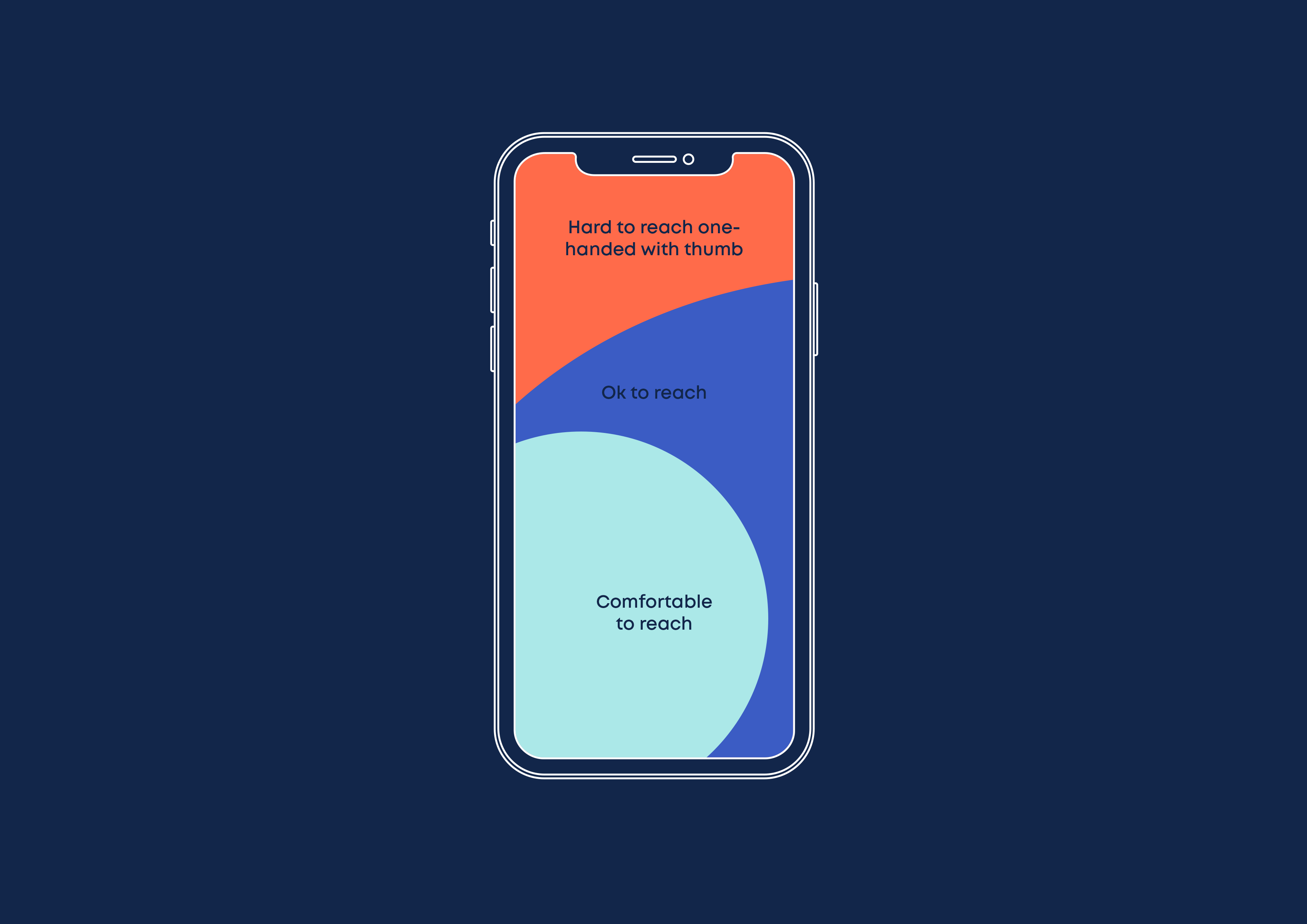
Hand position on mobile is something to consider. Majority of users hold their phone in one hand and use their thumb to navigate around a site. Make sure your site has key buttons featured in the easy section. Most sites will tend to have the handburger menu top right but it’s also recommended to feature this at the bottom of the screen.
Be considerate
Be considerate of your website’s accessibility. Think about colour contrast, font size, colours and tab areas. Don’t overlay text on 2 or more colours.
Avoid huge spaces
As mentioned, space is limited on mobile so avoid having large amounts of space. You don’t want users trying to find key information.


