Pubs are ordering in emergency stock. Wives & Girlfriends are scrambling to arrange long overdue meet-ups. The Samaritans are on standby. Yes, once again the England football team are about to embark on yet another glorious crusade of inept passing and nightclub altercations all the way to the Quarter-Finals. Bring it on.
Football has long since stopped being a game for the working class, and is now very much a global business. And, as with any big business sector or industry, football has targeted professional Branding as a key way of tying into their core audience and winning support away from their traditional fan-base.
Everything from the kit, badge and the team’s traditional style of play, to which ‘partner’ companies they associate themselves with, are carefully tailored to that specific team’s brand.
Brand England, for example, has meticulously perfected a winning balance of naive optimism and underachieving carthorses, and they really can’t be matched for that particular image anywhere in world sport…
A Brand Of Two Halves
Football Branding is quite often a fascinating area to look into, as most clubs- especially consistently successful ones- often have to straddle two polar opposites in order to move forward with their growth: to tie into the club’s rich heritage (it’s always a rich heritage, never a patchy heritage), whilst still appearing part of the relevant, modern footballing landscape.
In Branding it’s one of the trickiest tasks to negotiate, as you run the risk of alienating the original core audience that your primary success was built on (the tradition), whilst failing to win over new support (the modern); and it can often fail spectacularly.
The Lad’s Gotta Be Disappointed With That, Jeff…
Changing with the times can be a good thing. As a poncy designer I always encourage keeping a client’s brand current. But sometimes, well, maybe keeping it traditional is best.
Leeds United’s original logo was, like many clubs formed around the turn of the 20th Century, born out of the City’s coat of Arms. As the club grew and found it’s own identity, they went with ‘LUFC’ in a simple cursive script. Nice, if a bit unspectacular. But they obviously got a bit eager in the 70s to be a bit ‘trendy’ (the word that spells death for anything trying to actually be cool), and rebranded using what is now affectionately/mockingly known as the Smiley logo.
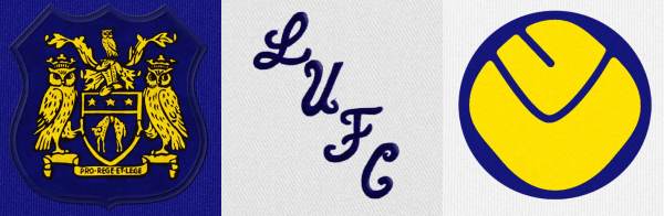
You’d struggle to find anything more 1970s than that – apart from British Leyland workers on strike, perhaps.
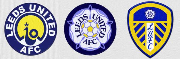
The Smiley stuck around in various forms and guises until the mid-80s. It was then that the club got a bit more ‘on message.’ After a frankly quite pleasant logo involving a peacock, the club rebranded again with the white rose of their Yorkshire roots, which remained part of the club’s logo when they rebranded again in the early 2000s- a blue and yellow shield (often a symbol of strength and defiance) which also brought back the cursive script of the 1960s.
But just as older clubs can struggle with staying with the times, newer clubs can struggle in finding their own identity.
When the Carolina Dynamo formed in the States in 1993, they were obviously keen to establish themselves. They wanted a logo that oozed class, tradition, success… but evidently someone else’s class, tradition and success, as they just nicked Nottingham Forest’s logo, added a blue triangle, and called it their own.
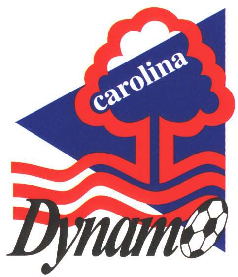
Amazingly they still use it today, untouched by Forest’s lawyers but heavily touched by people who like clashing primary colours.
Club-Approved Jumpers For Goalposts
The two most visible parts of a club’s brand are the club badge and kit. That’s quite possibly the most obvious thing I’ve ever written, but it’s the front-and-centre elements that visually define the club. You couldn’t imagine Manchester United playing in blue & white, or Barcelona in all white.
The colours aren’t just what separates the two teams on the pitch; they’re what binds supporters together, and they bring the fan-base together regardless of social standing, musical interest, or political/religious preference. As with any brand that has built a loyal customer/fan-base, such as Apple and their ‘Macolytes’ or a Fashion brand like Ted Baker, the fan identifies himself through his choice, and just like any successful business brand, that fan-base will be loyal returning customers, staying with the brand even when there are more enticing, successful brands around. Building that brand and that customer basis is key, and part of that brand is standing out in a crowded pitch/marketplace.
Changes To The Starting Line-Up
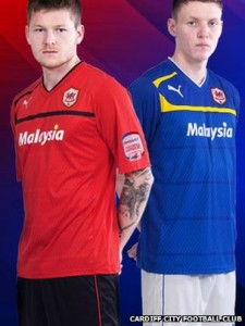
Cardiff City recently showed exactly how deep affinities for a brand can go, and the backlash that can arise when you get it very, very wrong indeed.
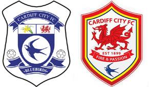
The Bluebirds were taken over in 2010 by new Malaysian owners, and in May 2012 it came out that there were plans afoot to make the football club more appealing to football fans in the Far East, which involved changing the blue kit which they’ve worn for 100 years to red (a colour which symbolises luck and wealth in Asia) and the bluebird crest to a dragon (a symbol of tradition and strength). The creative team behind the move reasoned, quite rightly, that both the red and the dragon tied deeply into Welsh tradition and history too; so to all intents and purposes, on a purely marketing level the move was a great one. But the plans were seemingly dropped quite quickly when the very vocal and apparent reaction from the grassroots fans was heard.
This wasn’t just a kneejerk fan reaction to someone meddling with their club. People can develop a deep-rooted affinity for brands, and whilst I’m sure there won’t be an armed revolution the next time Veet hair removal change their packaging, changing something core to a brand which has ties to a local community can provoke such a reaction – and this is something that the owners severely overlooked.
In recent years, you have big brands such as Gap backtrack over changes to their core image (in Gap’s case, a rebranding using one of the most uninspired and ‘vanilla’ logos ever seen for a business of their size) due to the reaction of the core consumer base. Although seeing the need to renew and refresh to keep current, they misjudged not only how much of a change the traditional customer was willing to accept, but also how the finished change actually appeared. Large companies have drastically rebranded in the past without such outpourings, but when the final product does not meet the standards set out, then it can set off that rejection.
However, just as this blog post was about to go live, news broke that Cardiff’s board had decided that the £100m financial incentive from their Malaysian backers is too much, and they are going ahead with the planned rebranding. It’s going to be very interesting to see if the fans reluctantly accept these changes, or if they will make their feelings known through the loudest message the club board will hear- the cash register.
Liverpool FC
Liverpool FC were recently questioned by a fan’s group over alterations to the club crest. LFC’s badge has undergone a number of changes over the course of the last 30 years. Untouched mostly since the club’s inception in 1892, the traditional Liverbird emblem had a simple shield added to it in the mid 80s to make it stand out on the shirt better. Following the Hillsborough tragedy of April 1989, two memorial flames- one for the victims of Hillsborough, the other for the early tragedy at the Heysell Stadium in Belgium in the moments prior to the 1984 European Cup final- were added, and the shield became more complex, with a graphical representation of the Shankly Gates (the entrance to the club’s ground- Anfield) positioned at the top, which has become a focal part of the local community.
This design lasted for 20 years until this current off-season where the club revealed a return to the more simple, traditional Liverbird. Aware of the symbolism and meaning behind the additions made to the club crest, the club approached families of the Hillsborough victims, and it was approved by them with the condition that the elements were accommodated elsewhere on the shirt design, so the eternal flames were moved to the back of the neck, framing the number 96 (the amount of victims at Hillsborough). It made for a very strong, simple shirt design, and although a rival group representing some of the victims came out in the press to voice their objection, the new design has been welcomed by the vast majority of fans.
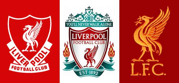
The redesigned crest used before this latest redesign was also punctuated with the use of turquoise, a choice of their then-kit manufacturer Adidas. The adoption of turquoise away shirts was seen as a good complimentary colour for the denim jeans worn by their predominantly working class fan-base, making a move away from the traditional Liverpool away shirts of the past towards a modern branding approach where the shirt is seen as a full extension of the brand; something which will compliment what the fan is wearing in the streets and on the terraces, rather than something that just serves the function of marking one team out from the other on the pitch.
It’s an approach that has seen a wholesale embrace from the footballing world. Where once teams would simply choose the opposite colour in the spectrum to their home colours, or a simple white kit with hints of the home colour in the decals, there are now greys, blacks, browns, and smoky blues, amongst others. Most teams with a large fan base now choose to change their away shirt every season, keeping colours and styles current and reflecting current trends in high street fashion. The lifestyle choices of the fans are now seen as part of the wider brand.
The Red Devils
The Football-Club-As-Brand ethos is best summed up with the team currently perched as the biggest team in the world- Manchester United. United’s badge, based loosely on the city crest, has barely changed since their name swap from Newton Heath back in the early part of the 20th Century. But in the mid 2000s, they did make one major change to the logo which speaks volumes for where they see themselves as a brand.
They dropped ‘Football Club’ from the badge.
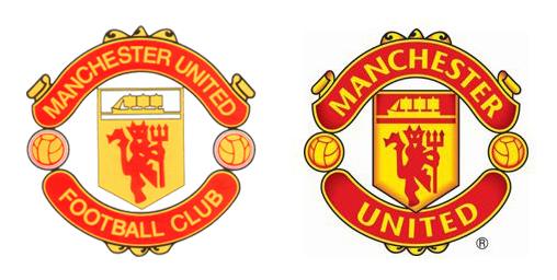
Although only a small physical change, this had a major impact in how sporting brands were perceived. Man U were essentially declaring that they were no longer just a sporting team, but a proper, honest-to-goodness lifestyle brand, not limited to their original market.
At The End Of The Day…
So what’s the future of sport branding, and football branding in particular? Well, more of the same, really. Clubs will continue to build on their existing image, whilst seeking out the benefits of new technology and new revenue streams.
Barcelona are probably the best exponents of harnessing new media to expand. Already one of the most recognisable sporting brands in the world with probably the best player in the world in Lionel Messi (although this site puts a convincing argument forward for Cristiano Ronaldo), the Catalan giants aren’t ones to rest on their laurels.
The club’s site is available in 6 languages, their Twitter feed in 3. They have some of the most downloaded club apps; they receive millions of hits on their official YouTube channel. They’ve been ‘liked’ 31 million times the world over on Facebook and have a strong presence on the Chinese equivalent QQ. They see the commercial value in keeping close to their customers.
But the club’s Business Intelligence Manager, Pasi Lankinen, makes no bones about who is leading the brand, and who is really keeping them current and at the top of the world market:
“The 11 guys are our brand marketers, they drive the attention to our club.”
Which is essentially saying that if your core product isn’t up to scratch, your wider consumer base will only remain loyal for so long.
3 Lions On A Shirt
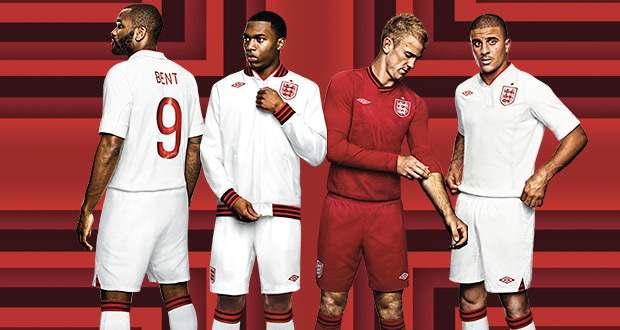
As for England, well we’ll be lucky to get a draw out of the France match, will hopefully beat the Swedes and the Ukrainians, before emphatically going out to the Spaniards in the first knockout round. But at least they’ll look nice in their Peter Saville designed shirts.